Thursday 18 November 2010

Production Material: Photographs

In this post I will show the images that I will use for the front cover, contents page and double page spread. All these photos will be the originals, and I will edit them when I come to producing the media product. Below are the final images that I have selected for my front cover, contents page and double page spread. Also are the results from the different photoshoots and live gigs that I have taken photos at.

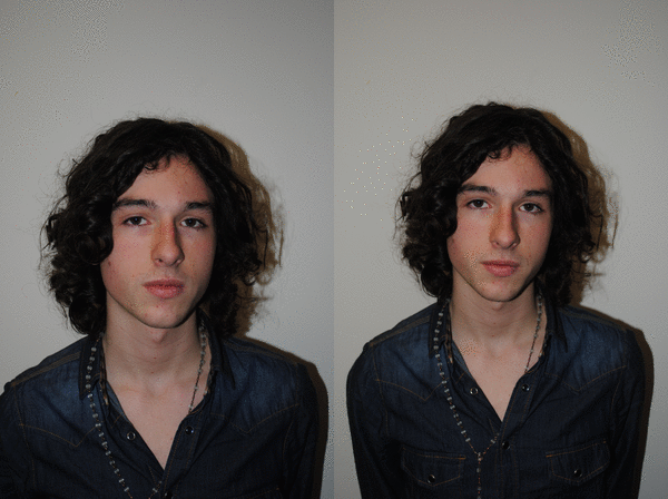
This is the photo shoot for the main cover, created in Picasion.com

gif animation maker

These are the images from the Canterbury gig, made in windows movie maker as a slideshow. The music track is 'Gloria' by Canterbury themselves.


These images are from various other gigs that I want to use for the rest of the contents page. I have made these using the gif animator from 'gifup.com'

This is the selection of images that I have chosen to be used for my production. These are all the uneditted versions of the images, and they will now be editted to fit the requirements I have chosen for my magazine.
Front Cover


Contents Page

Main Image


Other Images


Double Page Spread


Tuesday 16 November 2010

Production Material: Band Interview Notes

I conducted an interview with the band Canterbury, these are the interview notes:

Luke Prebble (Bass and vocals) and Mike Sparks (Vocals and Guitar)
So what were your inspirations for making Canterbury?
All grew up together in Surrey, went to live gigs and saw musicians, all friends and saw how much passion other bands have, Luke: “And I was just like, Fuck I wanna do this” Luke was in a band called Lucky For Some, changed its name to Canterbury, Mike was in a band which disbanded. Both bands played together. Mike Joined Canterbury. Mike: “I guess what we thought was don’t get your hopes up”
What helped Canterbury this far, making an album and a headline tour?
All friends throughout school, everyone helped each other. Couldn’t play many gigs so focussed on writing songs.  Main thing for them was music. Wrote thank you 2 years before it was released, recorded it after college. “We’re still proud of ‘Thank You’” worked hard, it wasn’t just snapped up a record deal like that and had their fame handed to them, they worked up towards bigger and bigger gigs
Who were your idols as the band was growing, influences?
Luke: Patrick Stump from Fall Out Boy, great voice, and one of the first good singers I sung along to. Brother’s driving lessons with their dad, would sit in the back of the car and sing along to FOB, Dad claims that is why Luke can sing so well.....Blink-182 and New Found Glory, Sugar cult (says Mike)
What was the best gig you’ve done and what makes the night enjoyable?
Luke: “It’s amazing to be able to say our most recent gig must be out best, having 500 hundred people singing the words back to you is just, manic” being an unsigned band, it’s like a reality check, and quite humbly. Southampton was a sell out gig, even weeks before the night the tickets had gone.
Plans For 2011?
Mike: “World Domination”Have around 40 songs, will release a new album. Possibly re launch Gloria and give it some justice, kind of unhappy with the reception compared to Calm Down, radio release with Fern Cotton. Luke: “it’s going to be a tough road, but we’ll try” possible record deal? Playing at Leeds and Reading, dream to be up there playing in front of so many people. Arenas,    Luke: “Never say no. I mean 500 people in London was great, but now 1000? We’re content with smaller venues at this stage, but if we are still here in a year then I won’t be happy.If you don’t believe in yourself, you won’t ever get there”
What was it like playing with ‘youmeatsix’?
Mike: “Fucking good at helping you. They are the kind of band who will help out smaller bands”.                                  Luke: “Guaranteed fun, awesome guys. We’re all from Surrey and we got on really well, sometimes if we’re with a band from like Scotland we can sometimes clash or get on really well, but with these guys it was great”.
What would be your ideal tour?
Luke: “Jimmy Eat World with a tour in America. Like a 50 date tour in every state. They’re a fucking amazing band writing fucking good music.” Blink would be amazing, if a little daunting.
Support or Headlining?
Totally different. Headlining it’s like your show, people have come to see you while supporting  you’re like warming up the crowd. Luke: “with like supporting you’re probably gonna be packed up by like 9, sound check at half 7, half an hour set from 8 to half 8, but with headlining you won’t get back til about 2. We’d get on about 10, which is usually like a wind down time, but it’s when we’re just starting. We get to the end and I’m like ‘Its like 11pm and I’m fucking buzzin’!”
Mike: “yeah it’s really tiring sometimes. You can’t even sleep in, you need to be out of travel lodges by midday.”
Article Research

In this lesson I have conducted all of the article research that I need for the band Canterbury. All of my research is present on this post:

http://www.canterburythankyou.com/
www.myspace.com/canterbury
www.last.fm/music/Canterbury

Interview Questions:
  • So what were your inspirations for making Canterbury?
  • What helped Canterbury this far, making an album and a headline tour?
  • Who were your idols as the band was growing, influences?
  • What was the best gig you’ve done and what makes the night enjoyable?
  • What are your plans for 2011?
  • What was it like playing with ‘You Me At Six’?
  • What would be your ideal tour?
  • What do you prefer; Support or Headlining?
Research into the band Canterbury:
  • Unsigned 4 piece band from the Surrey/Hampshire area
  • Met at school sharing a love for music
  • James Pipe (Guitar), Luke Prebble (Bass/Vocals), Mike Sparks (Guitar/vocals), Scott Peters (Drums)
  • Formed in 2005 in school and started to write the tracks for 'Thank You'
  • 'Thank You' availiable for free download from their site, along with their new single 'Gloria'
  • 'Calm Down' has just been released, and is availiable for sale on iTunes etc.
  • About to start touring with 'You Me At Six' supporting them in many areas.

Monday 15 November 2010

Planning Production

This week I further planned the production of my front cover and contents page. This involves images and text that will appear in my music magazine.

Front Cover
Images Needed:
High contrast close up of the main singer from Sydney Chasing Safety. Low angle with the model slightly looking down directly at the camera. Colour image, possibly desaturated. White background so the title and positioning statement (mainly black in colour) stands out.

Coverlines:
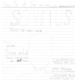
  • (Main) SINK OR SWIM? Sydney Chasing Safety's New Album ) (Unique font)
  • YOU ME AT SIX - on their new headlining tour
  • CANTERBURY Access All Areas, exclusive interview
  • NOT ADVISED The Up and Coming Band
  • UNSIGNED BANDS The future of music or classic copies?
  • FREE ALBUM - The latest singles from unsiged bands like 'Gloria' by Canterbury
  • Plus: Biffy Clyro - Young Guns - Elliot Minor - Mission District - My Chemical Romance - 30 Seconds to Mars - Paramore - Patrick Stump - Review of Leeds/Reading 2010

Contents Page
Images Needed:
  • Long shot of multiple band members from Canterbury (main image)
  • Smaller image of 'Not Advised' from O2 Academy
  • Image of Band members of Sydney Chasing Safety
  • Live photo of Elliot Minor
  • Live photo of Mission District

Text:

Editor Letter:
At ‘Sonitus’ we have only one aim; to bring the newest and best music to everyone. We specialise in providing you with music to rock your ears and to give you some great racks to listen to. Not just from the big names, but from the bands that we feel are going to make it big – very big. This month we’re providing you from some of the best unsigned bands we’ve found, such as Canterbury and Not Advised (but you’re definitely advised to see them!) Not only that you get a free album packed with their newest releases absolutely free! Tracks like ‘Gloria’ by Canterbury are promised to blow your mind, well at least your ears!
FEATURES:

04 Biffy Clyro - special interview
06 Paramore - out of the spotlight
09 A look into the O2 Academies
16 Elliot Minor - what are they doing next? 
12 Going Solo - Patrick Stump's plans
15 Leeds and Reading - Main stage reviews
20 You Me At Six - new headlining tour!
24 Canterbury - Access All Areas
34 Na Na...Na? - MCR’s new album
37 Gustav Wood - The new ‘Young Gun’?
45 A day in the life of - Josh Franceschi
60 Mission District - More than support?
64Sink and Swim – The New EP From Sydney Chasing Safety (contents page)
68 Unsigned Bands - Poor music or hidden treasures?
76 Backstage - what goes on

REGULARS:

07 Up and Coming - (featuring ‘Not Advised’)
10 RSVP – Have your say
17 Win tickets to...
31 Festival Photos
40 Next month

42 The best live photos of the month
50 Posters, posters, posters!
54 The best gig in the last month voted by you

57 New Music Column with Simon Neil
63 What’s on the free CD
74 Of Fame: featuring AC/DC
80 A look at the fans...

82 Gig Guide
88 A guide to the...
92 The tour map of...

Double Page Spread
An article featuring the up and coming band 'Canterbury' featuring an interview with the band.

Images Needed:
  • Long shot (full body) of main singer for the main image with guitar.
  • Photo/s of other band members and/or full band shot playing at the O2 Academy Liverpool
  •  
     These are rough sketches of the contents page and front cover:

    Monday 8 November 2010

    Publication Plan

    Over the past week I have created this publication plan to determine all the aspects of my magazine. Below is the completed version.
    – Latin for noise/loud; two of the most popular words that people associate with a rock magazine that my target audience found.
    Positioning Statement: Keep the music loud.
    Frequency: From the audience research I have decided to make my magazine a monthly production. I found that some people do not buy a magazine every week, and just sometimes just when they want to read so I think a monthly publication is the best idea.
    Price:  I have decided to price my magazine at £2.99. I have chosen this because in my research found that more people will pay over £3 for a magazine than people who wouldn’t. I think that this will be a good price because I am going to include a free CD with the magazine.
    Size: The average number of pages in my magazine is going to be around about 100 pages, to fit all of the regular and feature content in.
    Distribution: Newsagents, supermarkets (such as ‘ASDA’ and ‘Tesco’), music shops (HMV)
    Rationale: The music in the magazine is directed, for music fans of the genre. Not many adverts in the magazine as I found that that was the biggest thing that put people of music magazines. It will keep up to date with new music and provides a lot of reviews of new albums and bands. Band interviews being one of the main types of articles. There will be articles by the fans, and the opportunity to provide opinions for the magazines.
    Style: Informal and friendly and trying no­­­­t to use complicated language. Dark humour used to coincide with the slightly Gothic house style. ­­­Use of slang and colloquial terms to suggest the informal tone.
    House Style:
    ·         Cover lines: algerian
    ·         Headlines: Rockwell
    ·         Standfirst: Rockwell
    ·         Captions: Rockwell
    ·         Drop Capital: Old English Text, 5 lines deep
    ·         Start of paragraphs: First couple of words in bold
    ·         Body Text:  Times New Roman 11pt
    ·         Colour Scheme: Silver, Blue (maybe), Black
    Feature Content (based on band and article research)
    • Biffy Clyro - special interview
    • Paramore - out of the spotlight
    • A look into the O2 Academies
    • Elliot Minor - what are they doing next? 
    • Going Solo - Patrick Stump's plans
    • Leeds and Reading - Main stage reviews
    • You Me At Six - new headlining tour!
    • Canterbury - Access All Areas
    • Na Na...Na? - MCR’s new album
    • Gustav Wood - The new ‘Young Gun’?
    • A day in the life of - Josh Franceschi
    • Mission District - More than support?
    • Sink and Swim – The New EP From Sydney Chasing Safety (contents page)
    • Unsigned Bands - Poor music or hidden treasures?
    • Backstage - what goes on

    Regular Content
    ·         The best live photos of the month
    ·         Up and Coming: (featuring ‘Not Advised’)
    ·         RSVP – Have your say
    ·         Win tickets to...
    ·         New Music Column with Jared Leto
    ·         Gig Guide
    ·         Festival Photos
    ·          Next month
    ·         Posters, posters, posters!
    ·         The best gig in the last month voted by you
    ·          What’s on the free CD
    ·          Hall Of Fame: featuring AC/DC
    ·          A look at the fans...
    ·          A guide to the...
    ·          The tour map of...

    Sunday 31 October 2010

    Questionnaire Results

    Over half term I analysed the results from the questionnaire and created graphs and wrote conclusions for each questionnaire. I have created them on a powerpoint which I have embedded below using www.slideshare.net


    I recorded some people answer various questions using a voice recorder. These are the answers:

    Question 3 - What three words come to mine with the genre rock?


                                          Question 9 - What is your favourite type of article to read?


    Thursday 21 October 2010

    Audience Research - Questionnaire

    In this lesson we constructed our Questionnaire in word. I have created 15 questions to have around 20 people to answer. Ths is help me make decisions about the design, content, price, and frequency of my publication.

    Professional Double Page Spread Analysis

    In todays lesson we compared a variety of feature articles to the codes and conventions that we created earlier on in the course. I have analysed a feature article from Kerrang.


    Layout
    • Around 3/4 columns
    • Colour scheme is consistent and relating to the main image
    • Artists name is always highlighted and bold
    • Page number, including name, date, and possibly website in the bottom corners
    Images
    • 1 main image that takes up about 1 page
    • Most have a direct mode of address but is not necessary
    • Images are mainly on the left, but sometimes can be on the right or across the two pages (this is called bleeding)
    • If of a band, usually mid long shot or medium close up
    Text
    • Main title is short and snappy
    • Stand First - a bold paragraph underneath the title and/or above the article
    • Drop quotes in big letters from story are bigger to stand out (and are usually exciting or controversial by taking them out of context of the story)
    • Bylines - credits to the writer of the article and the photography
    • Main title unique and bold (possibly in a unique font)
    • 11pt font, generally a lot of writing in the article
    • Drop capitals (large letter at the start of the article)
    • Informal mode of address so it can connect with audience in a relaxing style

    Tuesday 19 October 2010

    Professional Contents Page Analysis

    In these lessons we analysed one contents page from a professional magazine. I chose "Kerrang" and annotated this. I then chose to present it using prezi.com to show a different media being used.


    Wednesday 13 October 2010

    Analysis Of Professional Front Covers

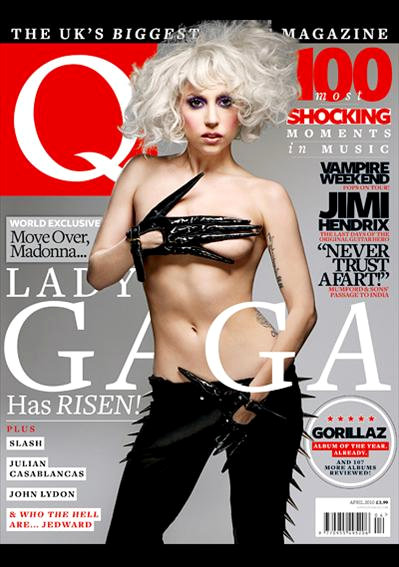
    In todays lesson we annotated three professional front covers. I chose 'Kerrang', 'Rock Sound' and 'NME'.


    Initial Ideas 2

    Using the results of my research I have made these decisions for my magazine

    Price: £2.20 - Competitive against magazines like 'Kerrang' produced weekly
    Frequency of Publication: Weekly
    Average Issue Size: 60-70 pages
    Regular Content: E.g. Reader's letters, Live Review, Album Review/Preview, "Win!"
    Feature Articles: Band Interviews, Awards Shows, New single from...

    Monday 11 October 2010

    Main Task - Researching The Market Place

    In todays lesson we started to research similiar music magazines to our own. These are the competitors for my magazine. I have looked at a number of Rock/Pop Rock magazines and made notes on various aspects.

    ROCKSOUND OCTOBER 2010 ISSUE 140
    Price: £3.90
    Publisher's Website: http://www.rocksound.tv/ (Published by Rock Sound Ltd)
    Frequency of Publication: Monthly
    Issue Size: 115 Pages
    Positioning Statement:New Music First
    Regular Content: "RSVP" and "Exposure"
    Feature Articles: "Blink-182" and "Rock Sound Tour Preview"

    KERRANG SEPTEMBER 25 ISSUE 1331 2010 
    Price: £2.20
    Frequency of Publication:Weekly
    Issue Size: 63 Pages
    Positioning Statement: None on the magazine
    Regular Content: "Gig Guide" and "Live Review"
    Feature Articles: "Sum 41" and "Muse"

    NME SEPTEMBER 2010
    Price: £2.30
    Website: http://nme.com
    Publisher's Website: www.ipcmedia.com
    Frequency of Publication: Monthly
    Issue Size: 67 Pages
    Positioning Statement: New Music Express
    Regular Content: "Reviews" and "Fanmail"
    Feature Articles: "Lewis from Chapel Club" and "Elbow"


    Sunday 10 October 2010

    Main Task - Initial Ideas

    This is the first post for my main task and we were asked to come up with our inital ideas for our music magazine:
    • The magazine is going to be for Rock/Pop Rock music
    • The target audience will be teens and possibly young adults

    Preliminary Exercise - Evaluation

    After completing my School Magazine front cover and contents page, there are many things that I have learnt and in this post I will evaluate the work that I have done in the past week.


    My media product conforms and challenges the codes and conventions of real media products in a number of ways. Firstly my front cover contains all of the elements of a media magazine should contain, for example the Bar Code, issue and price and date are all present in the bottom right. However I think that the layout of the front cover, and manipulating these elements could have been improved. The masthead, even though it still stands out, was made using the font tool, and should have been much more unique, as it would have stood more. The contents page deviates from the codes and conventions in a few ways. For example the font is 12pt, not 11, and the page numbers do not stand out. The images have been laid out in a way which is unusual for a contents page, and could be improved. The 3 columns are present (used traditionally in contents pages) and there is an effective number of features and regulars. The images do not have any accompanying captions to link the images to the text. However the main image is of an appropriate size for the main article.

    In creating this media product I used two programmes, one to create the front cover and the other for the contents page. As I was already familiar with Photoshop, the new technology that I have used was QuarkXPress. This was used to lay out the contents page using the columns and various box tools. For the next contents page I will try and use Photoshop and Quark together, transferring media across to make the technology more efficient.

    I think that currently my strength is with my experience with Photoshop and my ability to manipulate images. I thought that it improved my ability to produce the front cover. However I think that I will be able to improve my skills with Quark. I would like to be able to link the two programmes together to create the best music magazine that I will be able to. Overall I am more pleased with my front cover, and I will work with my contents page for the main task. I think the images that I took for the contents page could have been improved, and the subject matter. However in general I am happy with my preliminary task.

    Thursday 7 October 2010

    Preliminary Exercise - Contents Page

    In todays lesson we started and finished the contents page for the preliminary exercise using QuarkXPress 7.5.


    Theses are screenshots of QuarkXPress in making the contents page.

    Wednesday 6 October 2010

    QuarkXPress Practise

    In the lesson we had a workshop on how to use QuarkXPress 7.5. This is a screenshot of a practise project that I created.

    Preliminary Exercise - Front Cover

    In the last few lessons we have completed out front cover for our school magazine. Screengrabs of how I have manipulated the image are also included.

      
    Screenshots


    Thursday 30 September 2010

    Preliminary Exercise - Original Photographs

    In todays lesson we took our preliminary photographs for the front cover of the magazine and the contents page. These are all uneditted and taken with a Sony Cybershot point and shoot camera.

    Front Cover Image


    Contents Page


    This is my image for my main article based on the performing arts department


    Monday 27 September 2010

    Preliminary Exercise - School Magazine - Content

    In this lesson we had to plan the content, the features and articles that will appear in our magazine, and mainly on the contents page. I created a list of features and regulars, and these are:

    Regular Content
    • Interview with a teacher
    • Sixth Form article 
    • 10 Ways to....
    • Review of a subject
    • Charity Events
    Regulars
    • Review of a subject
    • Teacher Spotlight
    • Charity Work
    • Weatherhead TV
    • Local News
    • Student Competition
    • Have your say...
      Features
      • Free study and revision guides and how to use them
      • Frees and the best way to go about using them 
      • Are lunch prices too expensive?
      • The Music department trip to Holland
      • Review of the recent trip to London with the arts department
      • Beauty and the Beast
      • The new uniform, what do you think?
      • Latest news from the Head
      • Lights camera action! latest from media and film
      • A look into 6th Form life
      • Homework homework homework!
      • A new food menu
      • Ice Radio and its success
      • Iris points; are they worth it?
      • Follow You Print... follow me what?
      Images
      • Dinner hall
      • The art department (main image)
      • Sixth Form  

      Rough Layout of Contents Page

      Preliminary Exercise - School Magazine - Front Cover

      In our lesson today we started the preliminary exercise of the school magazine. Our task is to createa new school magazine front page and contents page. I have started out with the front cover.

      Plans for Front Cover
      • Title: Term Time
      • Mise-en-scene: Mid close up shot of student, with a clock in the distance maybe, school work, in a classroom
      • Coverlines: "The year flies by!" "10 tips for success at school" "Frees; are they really frees?" "Free revision and study guides"
      Rough Layout


      Sunday 26 September 2010

      Camera Shots

      In this lesson we learnt about the different types of shot. We were given a tasksheet to decide the different types of camera shots, and match them with different images given.

      Shot Types
      • Mid Shot: Shows half of the body, waist up
      • Mid Close Up: Shows head and shoulders
      • Close Up: All of the face
      • Big Close Up: Larger section of the face
      • Extreme Close Up: Single small section of the face
      • Mid Long Shot: Shows full body
      • High Angle: Camera pointing down
      • Low Angle: Camera point upwards
      • Tilt Angle: Camera on an angle
      • Over The Shoulder Shot: Camera behind the model looking over the shoulder
      • Two Shot: A shot with two people
      • Very Long Shot: Shows full body and background at a distance
      • Long Shot: Full body and background
      Camera Movement
      • Pan: Camera moves from left to right
      • Tracking: Camera on a dolly and following the action
      • Zoom: Camera goes closer or further away to the action 
      Worksheet 


      After learning the different shot types we were given a task to take specific photographs. These practise shots were:


      Wednesday 22 September 2010

      Codes and Conventions of Contents Pages

      In our lesson today we discussed the various codes and conventions of contents pages of music magazines. By looking at different magazines we have come up with a list of general codes and conventions. These codes and conventions are:

      Images
      • Larger image for the cover story, i main one and the rest smaller, under 10 photos
      • Photographer often credited (mainly for the photographs on front cover, as credits are never put on the front page itself)
      • All images have supporting texts.
      • All images are linked to the magazine and its genre.
      • Photos and page numbers are all correct and linked with the captions about the articles.
      • There are several subsidiary images that are also used to relate to the articles inside the magazine to interest the reader
      Layout
      • Masthead is present at the top, a smaller version of the one on the front page. 
      • The main word "Contents" is at the top, ranging from being in the middle or on the right/left.
      • Around 3 columns that are split into different sections, with a line gap between each section.
      • 11 size point font and must be consistent so that it is easy on the eye.
      • Around 20 features and regular articles depending on the size of the magazine. 
      • Generally around the sides of the page. 
      • Definite divison between regular and feature articles
      • Consistent font types and colour schemes (3/4) which links to the front page.
      • Dates are near the top.
      • The page numbers always come before a short introductory text that is usually an artist's name or ambiguous text (that is usually bigger than the average 11 size point font around 12/13). After this is the sublines which gives more infrmation. It is no bigger than 11 point font and is in roman text.
      Page Numbers and Contact
      • Page numbers are usually at the bottom of the page.
      • Websites, email and phone are usually at the bottom, as the least important thing will usually be smaller and at the bottom.
      • Page numbers next to articles must link to all other images, and are bigger and/or a different colour to the captions, and will always be to the left of the text.
      • Subscription details are on the contents page, making it easier to subscribe to the magazine.
      • There is sometimes a short introductory text from the editor of the magazine that welcomes new readers and gives a brief outline of what the magazine is about (e.g. the genre and main cover stories).
      Examples


        Tuesday 21 September 2010

        Codes and Conventions of Music Magazines

        In our lesson today we looked at 5 different music magazines and came up with a list of codes and conventions for the front pages. The codes and conventions I have come up with are:

        Masthead
        • Large titles, in the top left of the front page or all the way across from left to right.
        • Unique font that is easily recognised and different to all the other fonts.
        • The positioning statement is above or below the title.
        • It makes the genre clear to the audience (e.g. it is clear 'Kerrang' is a rock magazine)
        • Fits in with the colour scheme, easy on the eye but still stands out.
        • If it is a well known magazine, the image is able to overlay the masthead slightly. 
        Central Image
        • Plain background makes sure the image stands out and makes sure the image still retains a sense of formality. 
        • There is a direct mode of address; e.g the model is looking directly at the reader. 
        • The cover lines and all other text is around it anchors the image, so the text does not get in the way.
        • Picture - text - cohesion...the image must relate to the cover lines
        • Close ups/medium close ups or medium long shots (if a band). 
        Cover Lines
        • The main cover line is always bigger.
        • All other cover lines are the same size font
        • Links to the articles inside.
        • Around the outside so they do not get in the way.
        • Smaller pictures relate to the cover lines (e.g. "also in this issue)
        • Usually around 5 or 6 cover lines.
        • Text frames the main image by being down the side of the magazine
        • Only a few fonts are used (either serif or sans serif)
        Bar Codes
        • Price
        • Issue Number 
        • Date
        • Website (if relevant)

        • Consistent colour scheme, only about 3 to 4 colours used that are aesthetically pleasing and easy on the eye.
        • Buzz words i.e. 'exclusive' and 'new' are present attracting the readers attention.
        • Puffs = examples of free things in the magazine, also to attract attention.
        Examples